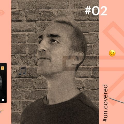
Tell us about your background and how long you’ve been with Tincan/Un.titled.
I’ve been with Tincan for more than 15 years, aka I’m a bit of an old hand, not quite since the beginning but close to it! I made the move to the Un.titled team earlier this year when Tincan and Un.titled joined forces.
Although I did IT for my degree, I spent a decade after university doing non-IT things – lots of voluntary work, including playwork and working with kids, as well as some creative things. I also travelled for a while and lived in Australia for a couple of years. When I came back to the UK, I did a web design course as a way into Tincan land and I’ve been on a UX trajectory ever since!
What‘s the main challenge in the world of UX design right now?
It’s probably easiest to break this answer down into terminology, awareness and acceptance and then finally the tech side of UX.
There are endless articles on UX, covering everything from UX simply being a buzzword to people claiming we’re in a ‘post-UX’ world.
Although there are a lot of interesting perspectives, to me a lot of this revolves more around journalism than actually being helpful. By this I mean that there are sensationalist, buzzword driven, clickbait headlines – everything from ‘Is CX the new UX?’ to ‘Is UX dead?’. People like to use the many acronyms as a way to explore this space – be it customer experience as CX, user experience as UX, user interface experience as UIX, or customer journeys as CJ. There’s plenty of overlap and discussion, but ultimately the end goal needs to be delivering the best experience possible.
This brings us onto awareness and acceptance. To me, UX – however we want to term it – has two overriding concepts. Firstly, it puts the user and their diverse needs at the core of a product. Secondly, and importantly, UX is a great leveller within any organisation or business as it necessitates equal voices. This means a managing director’s voice, or a head of department’s voice, are no more important than anyone else’s.
On the tech side, the real challenge is the sheer diversity of products to interact with. This previously revolved around screen size and touch due to the rise of mobile and then wearables such as watches. But it is now evolving into other interactions. There’s Voice User Interface (VUI) for tech such as Alexa, as well as virtual reality user interface (VRUI) for example.
How do you look to strike a balance between good usability and strong design?
Ideally by testing and iterating. Good UX processes involve frequent testing and iterating of usability, whether in wireframes or design.
Design centres around usability, rather than just brand, colours or typography. Usability over gimmicks is important.
You work across a lot of different sites and sectors. What are the main differences and challenges in designing for them?
Good question! Working mainly in the arts and cultural sector, we see many people with similar requirements. But interestingly, they still all have diverse flavours and variants within them.
By their nature, they have a lot of changing content with rich imagery and the like. Other sectors such as something like property for example tend to struggle with that content and are often wordier by nature, so the challenges are different.
How do you find collaborating with so many people from different departments/sectors/walks of life?
Working with clients is the bit I enjoy the most!
My role is often to facilitate the space where user needs and the clients’ needs come together, and this is something I love to do.
Tell us about the UX workshops you run. Why are they important and what are the benefits?
The UX workshops are creative spaces where everyone works together, engendering lots of discussion on a level playing field. They are a core part of the process and fundamentally allow us and the client to begin to understand their audience.
The workshops usually bring about a shift in client perspective too – from an organisation-first point of view to a user-first point of view. This is pivotal to every element of the process – from content modelling, to design, to tone of voice and language, to imagery and more. It’s also a powerful understanding as, when questions come up around things ranging from content to strategy, those questions are always referred back to the user as a foundation, which helps to answer them.
Can you shed some light on the tools you use?
The initial workshop phase is very low tech. The aim is to discover audiences, model content and look at layouts. So they tend to revolve around discussion more than anything else.
In terms of tools, I use Sharpies and Post-it notes for the most part, but also a flip chart and paper. We also use the space we’re in, putting things on walls, exploring ideas, scoring concepts and so on. The only tech used in the majority of workshops is me taking photos on my phone to record these outputs, before I write them up.
Moving forwards from the discussions in workshops and general lo-fi prototyping, the next stage is to create a hi-fi set of wireframes. Although there are many wireframing tools out there, I like to use Sketch (not strictly a wireframing tool), linked to InVisionApp. This allows us to create sets of wireframes which not only outline content layout, but also can start to look at functionality and interaction. Sketch files are synced to InVision, where we can add links, layers and more. Although these are hi-fi prototypes, they are at a good stage to be tested and iterated.
As we work in a team, the Sketch files are shared in Dropbox and the InVision projects are shared in InVision.
Testing can happen in a number of ways. We tend to test wireframes in person, asking users to complete a set of key tasks and to talk through the task as they go. We’ll use a laptop’s in-built screen recording for this (eg Mac = Quicktime) to capture the tasks from an audio and visual perspective while also writing down their responses. The outputs of testing can be collated and agreed upon, which can feedback into the Sketch wireframes.
Design also happens in SketchApp, as it’s a lightning fast and light vector tool. Again, as with wireframes, design screens are synced to InVision, which we use as a presentational tool with the client.
Handing over signed-off designs to developers happens with InVision. Sketch files can be accessed via InVision’s ‘Inspect’ mode, where developers can access elements, CSS, measurements and so on.
These assets are also written up in a Google Spec document and the files output to shared DropBox folders.
Away from UX Design, what rocks your boat?
Funnily enough I live on a boat, and it does rock! I love boat life, being in nature within the city and living within a great creative community.
I’m a wannabe bassist (I don’t practice enough!), enjoy boating, have a close connection with Spain where I grew up, and I spend way too much time reading.
We hope you enjoyed the latest in our Un.covered series.
Stay tuned for the next one and meanwhile follow us on Instagram to see what the Un.titled team’s been up to recently.


