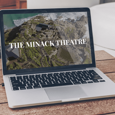
The new site allows users to buy tickets of course, and the ability to add emergency messaging particularly relevant to the current situation.
More importantly, the design prioritises easy-to-digest information about general visitor information for those visiting Minack’s stunning location, for a show or simply to take it all in.
We did a lot of data research as part of building the new Minack site to inform our UX design work. A simple, small example: their most popular page is an old-school 24/7 webcam, so we made sure to give it pride of place in the main navigation on the new site.
Watch this space! We’ll be putting a full case study on the site shortly.


