PHES

The Challenge
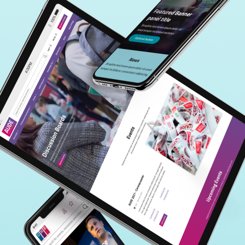
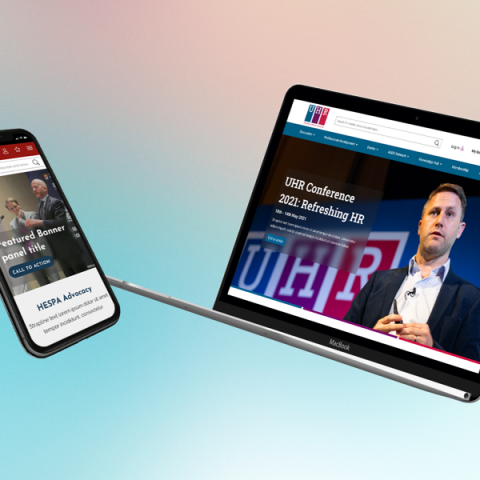
PHES wanted to revamp five of their websites – AUDE (Association of University Directors of Estates), BUFDG (British Universities Finance Directors Group) / HEPA (Higher Education Procurement Association), HESPA (Higher Education Strategic Planners Association) and UHR (Universities Human Resources).
PHES asked Un.titled to complete the discovery, UX and design stages for the revamped PHES sites. The Un.titled team faced was in creating an visual design and UX framework that worked for one and all five sector organisations to PHES, creating separate yet consistent designs for each faculty of PHES.
With our various different organisations who wanted the same end product but still wanted to maintain their identity, it was a tricky project to navigate. Throw in the pandemic, the enforced delay and having to do your usual work at distance... let’s just call it a challenge.
Dominic Fryer, Managing Director, PHES

The Solution
After initial discussions with the PHES team, we (remotely) held a series of workshops to help us understand the organisation’s objectives and audiences. This helps set a clear precedent as to what PHES’s various digital platforms are supposed to do and who for.
This included establishing a measurement model with PHES, which is the strategic, structured approach we take to the gathering and analysis of performance data in support of engagement. The model covers things like acquisition, behaviour and outcomes.
We worked with PHES to agree business objectives and website goals, as well as setting KPIs for these website goals, setting targets for the KPIs and segmenting analytics data.
The Un.titled team also carried out extensive user testing work. We led a closed card sort to test whether users understood the navigational language being proposed. The task here had a particular focus on a name change for one of the primary navigation links. This was previously called ‘Resources’, but the discovery phase workshops outlined that the client wanted to updated this to ‘Knowledge Hub.’ The name change was validated as the majority of users (93%) placed the correct content into this area. The test also highlighted some signposting opportunities between sections where content was relevant to both.
We also tested first-click analysis on the homepages. We asked participants to find a resource about the impact of Brexit on UK universities on one of the PHES sites. The participants were presented with a homepage wireframe and their clicks were recorded. We followed up with questions like ‘how easy was it to complete your task?’ and ‘on the screen you just saw, what would you improve to help with the task?’ These questions provide real gems of feedback which we folded into the overall analysis.
From this task we found that some users could be confused between the labelling of two sections: Learning and Knowledge Hub. While these areas contain different types of content, the labels alone weren’t indicative enough of the destination. We therefore updated our wireframes to include a short summary text for each signpost.
A further part of our user testing saw us investigate whether PHES’ members would utilise a personalised dashboard if they landed on it upon logging in to the site or if they ignore it and use search or the main navigation instead. The dashboard was something we were proposing to include to help users easily navigate their interests and organise their content. Feedback received around this during user testing included adding the user’s name to make it feel more personal, including messaging about what the user can do with their dashboard, adding relevant tags to each item presented to the user so they can understand what it’s related to, and updating the layout to give some sections more prominence as some items would be used by the user more than others.
The analysis we gleaned from this part of the user testing was written up and presented to the client, discussed and the agreed updates rolled into the wireframes and specification document we created.
We also ran a persona workshop to better understand these objectives in the context of PHES’s end users. We then tailored our approach to meet the various requirements of hypothetical users of each site on the back of these workshops.
Our Design and UX team then set about creating a series of designs for PHES’s various entities which would be passed on to PHES’s developers. These developers agreed that a design for every page would not be required given the number of screens that would need to be produced. They agreed instead to work from each site’s style guide and with a set of shared page layouts, also known as content types, which the Un.titled team created as points of reference.
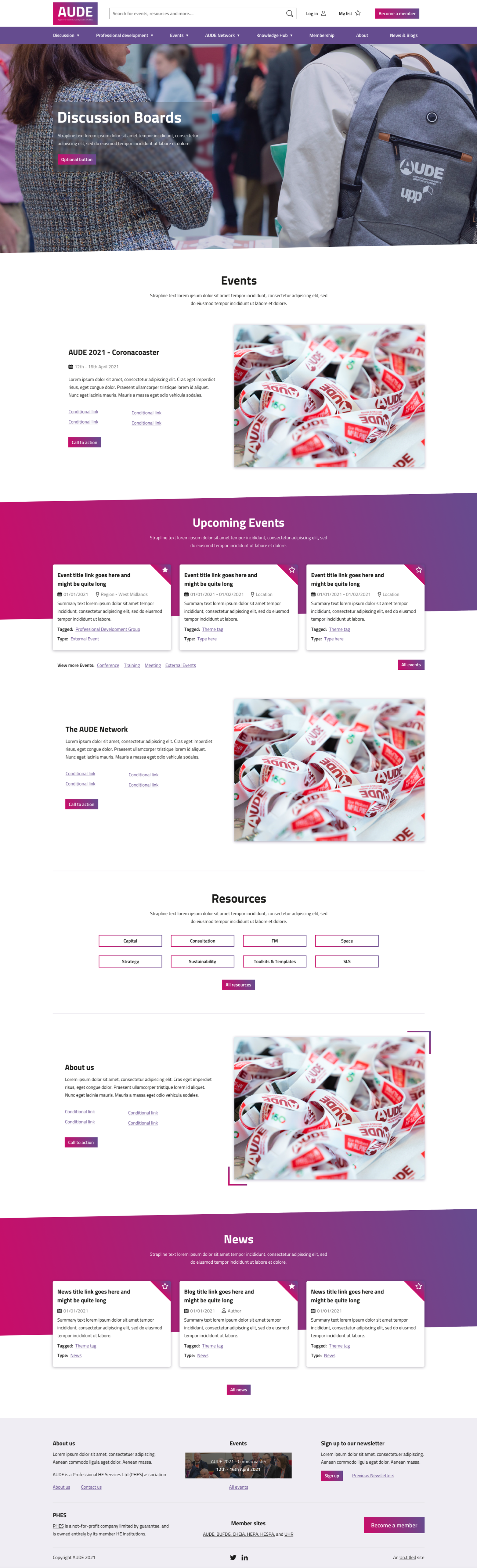
These content types included Homepage, Landing Page, Default Page, Listing Page (4x variants), Resource Page, Event Page, Conference Page, Dashboard Page, Discussion Page, News Landing Page, and News Page. This provided the development team with a variety of templates to use when developing each organisation’s site.
Our UX and Design team created sitemaps for each of the sites, as well as wireframes to enable PHES’s developers to accurately reflect our aesthetic vision for each site and page type.
We created a set of assets which we shared with the developers, making it easy to turn our vision into a reality. These contained actionable insights and instructions as to the thinking behind the design we created for each content type.
This was all done between late 2020 and early 2021 with the COVID-19 pandemic affecting logistics and ways of working. However, the Un.titled team was more than capable of rising to the challenge and delivering exactly what PHES wanted. This saw us receive glowing praise from the PHES team for our efforts.
“Leon, Andy and Ben rose to that challenge and we find ourselves with 5 great designs and 5 very happy organisations,” said Dominic Fryer, Managing Director, PHES. “Leon expertly managed the project, dealt with everything we threw at him and was always there to guide us through the various stages. In projects like these, clear communications is essential and Leon provided exactly that.”
“Sometimes the deadlines for turning things around at our end were a bit tight, but I think we managed to hit them and Leon was always happy to allow a bit of wriggle room if possible. It kept our focus which was important.”
Services
One of the hardest elements of the project was to give each site their identity without much of a style guide to work with, but through creative touches and accents the Un.titled team have come up with some great looking sites.
Dominic Fryer, Managing Director, PHES