We’ve previously discussed the importance of web accessibility. This is not just from a user perspective, but also why every organisation with a digital presence should care about it (In a nutshell: it’s the law, it will help with reach AND it’s good for business).
Speaking of the law, all public sector companies in the UK need to ensure that their websites (both new and old/existing ones) are accessible by September 2020. So, if your website isn’t up to scratch when it comes to meeting accessibility standards, it’s high time to change this.
To help you on your accessibility journey, in this blog we’re exploring how you can improve the accessibility of your website by looking at a couple of examples of how we achieved this for some of our clients.
This was not just around the front-end and ensuring that brand guidelines translated well to digital, but included the assessment and improvement of technical aspects in the back-end.
Museums & Galleries Edinburgh
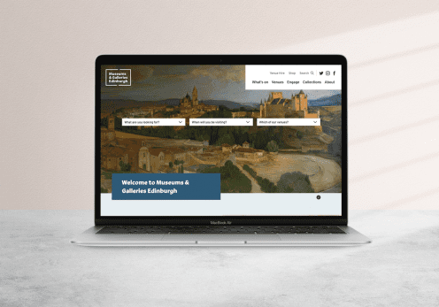
Museums & Galleries Edinburgh, a collection of 14 venues and over 200 monuments across Edinburgh, came to us with a fairly comprehensive Brand Guide. As this was rooted in print, part of our task was to evolve this to work for digital.
What we did
Brand evolution
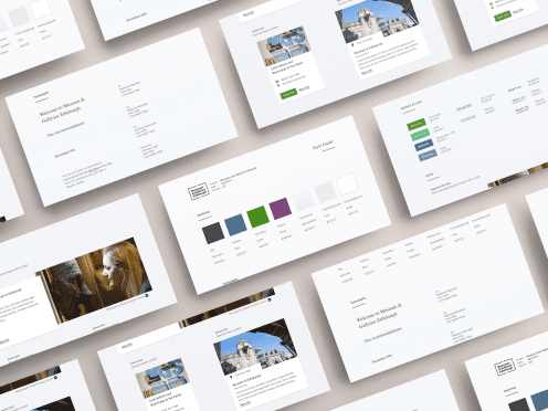
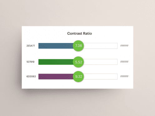
From an accessibility point of view, the brand colours were tested and, as some of them failed WCAG AA standards, we adapted the palette to ensure that they passed. This adaptation can take the form of using the primary existing colour and treating it as the root from which to find a close version that is accessible. From there, the creation of a set of complementary colours is possible.
As our UX approach is data-driven, the insights from our UX workshops and work around defining the audiences for Museums & Galleries Edinburgh also fed into the evolution of the digital brand guide. This occurred by taking these audiences into consideration when selecting colours and typography.
The same applies to their typography where we focused on digital-first fonts which were close to their print originals, but would be best suited to digital. Accessibility around typography goes further, involving leading, vertical rhythms and so on. So we always base the design language around a font system as generated via TypeScale.
Behind the scenes
Web accessibility is about more than just the front-end visuals though. It also relies on the underlying code being generated and the platform which generates it, such as a Content Management System (CMS). WCAG outlines an extensive set of rules to adhere to, ranging from semantic meaningful code to the way in which UI elements function. An example of this would be how a form is read (by a screen reader) and then submitted by a user.
At Un.titled, we are always iterating our baseline foundation code which we use for projects. We ensure that it works for all users as much as possible, while being as light (in terms of page weight) to help with page load speed. This is important from an SEO perspective.
For Museums & Galleries Edinburgh, we wanted to deliver a neat solution to a complex set of requirements, so we facilitated extensive workshops about how best to structure the site (which, as part of usability, is also part of accessibility).
Content is king (and accessible)
While we deliver the best framework possible for accessibility, there’s an onus on the content (and therefore the client) to also be as usable as possible. We provide training and resources to aid with this, covering topics such as adding meaningful and SEO-friendly page titles and meta data, image alt tags and more.
National Theatre: The Deck
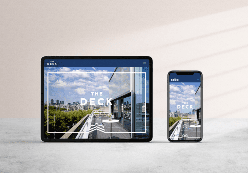
The Deck is a stunning events venue situated beside the Thames on the roof of the iconic National Theatre. As a part of the National Theatre, proceeds from events held at The Deck go towards the theatre’s incredible programme of artistic work.
What we did
Brand evolution
The Deck Brand Guide uses an elegant font combination:
- Body copy - Cheltenham serif font
- Headers - Raleway sans-serif font
As the Brand uses All-Caps, we investigated the Raleway font, looking at varying sizes in All-Caps format with specific attention to letter-spacing and to letter shapes. Users with dyslexia for example can find it hard to discern between capital ‘O’ and ‘D’ and some fonts can exacerbate this issue.
In relation to readability surrounding capitals, WCAG says:
“Text in all capital letters is more difficult to read for most people, with and without disabilities”.
It’s vital then that users can change the capitalisation (all capital letters, small capital letters, sentence style) of blocks of text via browser style-sheet tools. In the case of The Deck, all (visual) cases of capitals (Headers etc.) are actually only capitalised in code, but altered via CSS to be all-caps.
“Some accessibility needs are better met in the browser than in the web content, such as text customisation, preferences, and user interface accessibility.” - Yichen He, The Next Web.
Image alt tags
Whilst the concept of alt tags for images has been around for a long time, there’s a skill in writing meaningful descriptions which are useful to all users - particularly those consuming your website via a screen reader for example.
At Un.titled, we advise our clients during training on this topic, and we’ve also written a handy blog about how to write suitable alt tags. In addition to this, the CMS will always have alt tags on image fields as ‘required’ to ensure this content is added.
On the main ‘Hero’ image of the The Deck for instance, the alt tag is: “The Deck event hire space interior event setup with chairs facing a lectern with a view east to St Paul's Cathedral”.
This is meaningful for the user, helps with SEO and conforms with the aim “to put the most important information at the beginning”, in terms of sentence structure.
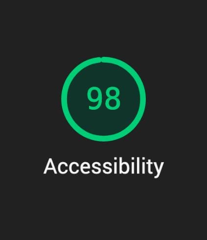
These are just a few examples of the elements you need to consider and work on when improving the accessibility of your website.
We hope this blog was useful. If you have more questions about accessibility or need a helping hand to improve this for your website before the September 2020 deadline (or at any point, really) we’re here to help. Just say [email protected].


