The Challenge
The Courtauld’s previous site was built on WordPress and was, in a word, huge. It was somewhat dour, and uninviting to wider audiences. Brand components were bland and didn’t represent the direction the organisation was going in, while the UX and design were outdated.
The user journeys on the site were ill-thought out, calls to action were sparse and not always clear and easy to follow. The content also had the potential to be enhanced, and didn’t adhere to a single tone of voice. Also, the site did not fully comply with accessibility regulations.
The Courtauld website was a complex proposition, with multiple stakeholders and an even wider set of audiences to consider.
Michael Kent, Operations Director, Un.titled
The Solution
Spy Studio already had a working relationship with The Courtauld, having just completed a full rebrand of the organisation.
We started with discovery and UX, defining our measurement model and carrying out user research. During the discovery process, we determined that the objective and goals for the new Courtauld site could be distilled into three main priorities: create awareness, drive footfall and increase revenue. This helped shape all our work moving forwards, while we also ran a host of interviews to get buy-in from the wider group of stakeholders.
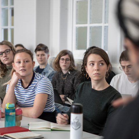
The other primary foundation for any site is getting to know the audience. The Courtauld has a diverse audience landscape, so we needed to identify who they are and what their needs and expectations of the site might be. This was informed by various inputs and data points, such as audience segmentation information, survey data, and Google Analytics data. These served as a great starting point for the discovery workshops, to help us craft a comprehensive picture of the site’s audience – both current and aspirational.
Next, we evolved those sets of audiences into personas. This is where we can gain a detailed understanding of their needs and expectations, how and where to reach them, and what parts of The Courtauld’s offer they are most likely to engage with. This gives us the confidence that we are building platforms which real people want to use, and will return to over and over again, rather than just a pretty picture which looks great but doesn’t actually meet the needs of the various audiences.
The more we know about audiences, the more we can help structure site content in a way that makes it discoverable to them. The content modelling element of the process did just that, amalgamating everything we knew so far to create a detailed Sitemap. This has a navigation which is user-led and user-first.
While The Courtauld has a wide range of sections, the sitemap and the corresponding navigation is very focused. We also fold in the tech stack into these considerations, analysing what tech is in play, what’s achievable with it and what’s not.
Once the discovery workshops were complete, we then took everything we had learnt and all the outputs so far to create a comprehensive set of wireframes, to visualise key user journeys and page types. When creating the various content types or templates, we take the approach from a mobile-first perspective, as this allows us to truly focus on the hierarchy of the content.
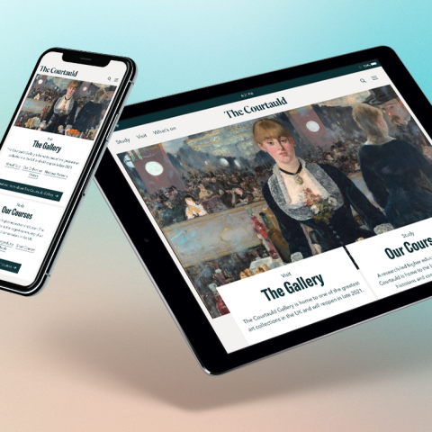
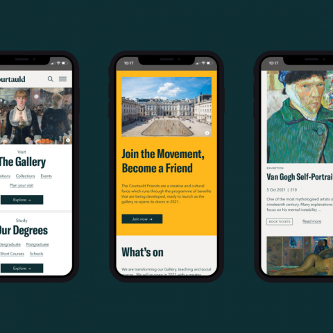
Given the breadth of The Courtauld’s offering, and the range of audiences, we outlined a header and navigation system which is super focused on the three main navigation items, of which Study and What’s On speak directly to their primary objectives and their audiences.
At the same time, there were many other audiences to consider. Their journeys are served by the expanded menu, and by other routes into deeper content. This includes searches, landing pages, links from social media, newsletters and more.
Data plays a big part in the discovery and design process. For example, device screen dimensions inform the wireframing and design phase. It’s important to note that we don’t simply select the dimensions with the most users, but rather investigate those which will have the widest reach, without excluding anyone. The result is that The Courtauld site now works beautifully across all devices, but it’s even more optimised for The Courtauld’s core audiences.
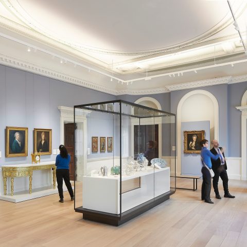
Once the full set of wireframes were presented, tested and iterated, it was then over to Spy to apply the brand and develop the visual style. We integrated the extensive and detailed UX work with Spy’s digital brand guidelines and visual designs to produce a stunning front-end. The visual design then folds in The Courtauld’s carefully crafted brand guidelines to produce a great looking site with a more user-friendly, accessible and adaptable design, and one that works across a huge volume and diverse range of content.
Next, we implemented the technology build. Like the old site, the new site also uses WordPress, but it has been redeveloped from the ground up. Because the site is expansive and complicated due to the number of strands within The Courtauld’s offering, the build and configuration was a significant undertaking. We also introduced React into our build, and on the What’s On page there’s a JavaScript React app running within the WordPress theme. This is something we will be able to produce for other projects moving forwards.
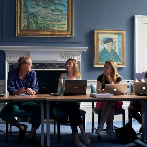
The Courtauld were also very accessibility-aware, and this was a prime requirement of the work we did with them. Accessibility is never something we ‘add on’, but is part of our end-to-end process and included in all ongoing content post launch.
During the discovery phase, we include accessibility requirements for site users in the persona work when investigating their digital audiences via the ‘3 As’ – ability, aptitude, attitude.
During the UI phase, we ensured that all accessibility requirements were fulfilled – whether that’s typography (reading width, font size, line height and so on), colour contrast, interaction effects or another element.
During the build, we already knew our base templates were accessibility-ready out-of-the-box, and include things like skip to content link, forms and so on. We also knew that the CMS itself has the required fields, such as image alt tags. Unique to this project was a requirement for an image gallery of a certain type. The client had these requirements listed out and we found a plugin which fulfilled them but, when held up against accessibility requirements, the plugin wouldn’t cut it. As a work around, we simply wrote our own bespoke gallery module, which does fulfil those accessibility requirements.
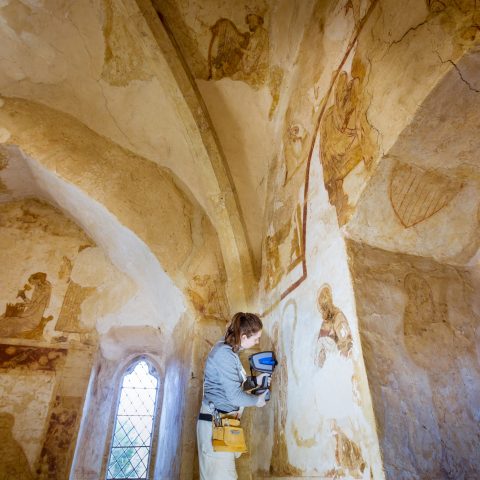
During the training phase and content load, we gave the relevant editors a ‘Content Guidelines’ document, as we do with all our clients. This document outlines important content-related info, such as tone of voice and use of formatting. It also helps with accessible content, such as writing style, and creating meaningful image alt tags, for example.
Once content was loaded, we conducted plenty of pre-launch checks, including further accessibility testing, both with the automatic tools and manual testing.
Post launch, the client invested in the SiteImprove tool to use as an ongoing monitoring tool of their site.
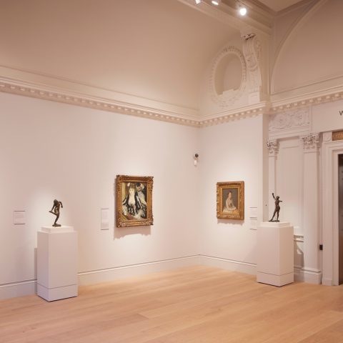
Our work needed to be completed to a tight schedule, and in line with the reopening of The Courtauld gallery, which had undergone a three-year refurbishment. As such, the main site went live in May 2021.
We then engaged in a series of subsequent projects. These were namely a new box office system and CRM using Tessitura, and we built a new Shopify store. We have used Tessitura with a number of other clients over the years, including Young Vic.
We utilised our expertise in Tessitura to take the purchasing of tickets for events and visits to The Courtauld to a new level. This included ensuring that styling, branding and theming continue seamlessly into the ticket purchasing experience. The new Shopify store saw us take our web design and UX capabilities into the ecommerce side of things. The shop allows people to buy artistic gifts from The Courtauld online, as well as prints, books, stationery and even fashion items and products for the home.
Our ticketing and ecommerce work with The Courtauld was completed and live to an exacting project timescale by September 2021. Since launch, over 85% of gallery visitors are completing their ticket purchases online prior to their visit. This is bringing great benefits in terms of the visitor experience, with important visitor information provided in booking confirmations and pre-visit emails, speedy ticket check-in on arrival and reduced queuing time for on-the-day visitors.
The drive to online ticket sales is also providing The Courtauld with a rapidly growing database of gallery and shop customers, along with general and special interest newsletter signups. This is building a valuable repository of rich customer data with which to analyse and understand ticket and shop buying behaviours.
Additionally, through the provision of cross-selling features such as eye-catching signposts and well-placed links, The Courtauld has been able to successfully promote its Friends and Patrons membership schemes. These are important schemes for promoting customer loyalty and increasing philanthropic donations in support of The Courtauld’s mission, and The Courtauld has more than doubled its membership since launch.
Services
Technologies
The Result
With all the right components in place, it became easier to fulfil the principles The Courtauld was aiming towards: be relevant, interesting, open, demonstrate expertise and provide a sense of narrative. This has been successfully combined with enhancing The Courtauld website’s user friendliness and accessibility, as well as our own adaptability in working with a huge volume and variety of content.
While the increases in revenue have been eye-popping, one of the most satisfying results has been that The Courtauld have seen an increase of 80% in user sessions across the board and even more importantly, they’re now supporting 85% of all ticket purchases, online. Furthermore, this has been achieved with no increase in digital staffing levels.
Together we’ve driven and converted traffic efficiently and with real impact for the organisation. The Courtauld has signed a retainer with Un.titled, which will see us deliver ongoing development work. We have also agreed a service level agreement with The Courtauld. This will see us provide hosting, maintenance and support for the main Courtauld site, as well as number of other sites they own and operate.


